Strategy
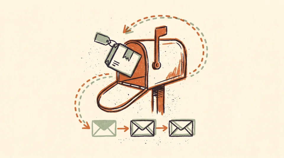
List Growth That Doesn't Trash Your Deliverability
Growing your email list fast is easy. Growing it with people who actually open and buy is the hard part - and the only part that matters.
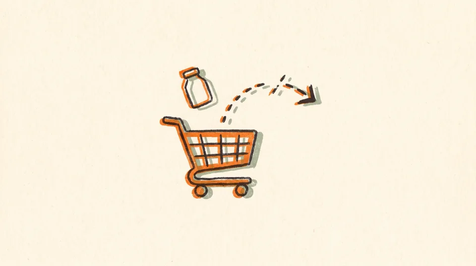
Someone lands on your product page, reads the description, maybe scrolls through the photos - and then leaves without adding anything to their cart. Most stores do nothing with that signal. That's a mistake, because browsing is intent, and intent is worth following up on.
Browse abandonment sits in an awkward middle ground. It's weaker intent than an add-to-cart and much weaker than an abandoned checkout. So a lot of brands skip it entirely, or throw the same cart-recovery sequence at it and wonder why it underperforms. Neither approach is right. Browse abandonment deserves its own flow - a lighter-touch one - built specifically for someone who showed curiosity but not commitment.
Product page visitors who add to cart represent a smaller share of traffic than many brands expect. That means a significant portion of your high-intent traffic - people who clicked through to a specific product, not just the homepage - never enters your cart-recovery flow at all. Browse abandonment is how you reach them. The conversion rate will be lower than cart recovery. That's expected. But the sheer volume of people in this bucket means even a modest response rate adds up over time.
There's also a qualitative reason to build this flow. Someone who browses a specific product has revealed a preference. They didn't land on a category page and bounce. They looked at a particular thing. That's useful information for what you say and how you say it.
Before you write a single word, tighten your trigger criteria. Broad browse abandonment - triggered by anyone who views any page - is mostly noise. Here's who should actually enter the flow:
Klaviyo handles most of this logic natively through flow filters and trigger filters. Set them up before you launch, not after. A browse abandonment email hitting someone mid-checkout is awkward at best.
Two emails. Maybe three if your catalog skews toward higher-consideration purchases. This is not the place for a five-email nurture. Browse abandonment intent is real but thin, and badgering someone who glanced at a candle is how you lose them for good.
This one should feel almost accidental - casual, not salesy. Reference what they looked at. Show the product. Write copy that sounds like a friend mentioning something you forgot, not a brand screaming at you to buy. No discount yet. You don't know why they left. Maybe they got pulled away. Give them the easy path back first.
If they didn't convert on the first email, give them a reason to reconsider that isn't just 'here's the product again.' Depending on your catalog, this could be a brief explanation of what makes the product worth it, a note about low inventory if that's genuinely true, social proof, or answers to the most common hesitations. Still no discount unless your margin and strategy support it. A lot of DTC brands train their customers to wait for a code by attaching one to every second email.
If you sell higher-priced or higher-consideration products - furniture, skincare regimens, technical gear - a third email can work. Use it to either make a final case for the specific product or redirect them toward something related. After this, let it go. They're not buying this item right now, and continuing to email them about it just erodes trust.
The most common mistake in browse abandonment copy is over-explaining. You don't need to relitigate every product feature. The person already read your product page. What you need to do is re-create a moment of want - remind them why they stopped and looked in the first place.
Write to the feeling, not the spec sheet. Someone who looked at a pair of boots doesn't need to be told they're made of full-grain leather again. They need to feel what it's like to own them. The difference looks something like this - a spec-sheet line reads: 'Full-grain leather upper, Goodyear welt construction, available in three widths.' A feeling-led line reads: 'These are the boots you stop thinking about other boots in.' Same product. One closes the tab; the other opens the wallet.
This is also where brand voice does serious work. A browse abandonment email from a brand with a real personality - specific, a little unexpected, not corporate - tends to outperform a generic 'You left something behind!' template. The message is essentially the same. The difference is whether it sounds like a human wrote it for your brand, or like it came from a default flow someone installed and never touched.
For Email 1, a subject line like 'Still thinking about it?' paired with an opener like 'You were this close.' will almost always land better than 'You viewed [Product Name] - come back and shop.' The first sounds like a person. The second sounds like a database.
Browse abandonment emails don't need elaborate design. In fact, over-designed emails can feel like a hard sell, which is the wrong register for this moment. A clear product image, a short headline, two or three lines of copy, and a direct link back to the product page is often all you need. If you sell visually strong products - apparel, home goods, food - a well-composed product photo carries the email on its own.
A few things worth getting right: make sure the product image renders cleanly on mobile (the majority of opens will happen there), include descriptive alt text so the email holds together when images are blocked, and keep your image-to-text ratio reasonable for deliverability. When in doubt, a plainer email - even near-plain-text - can outperform a heavily designed one for this flow type. The goal is a gentle nudge, not a billboard.
They fire browse abandonment emails at everyone who views any product, including their most loyal repeat customers. If someone has bought from you six times, they don't need to be remarketed to every time they browse your site. They're probably just shopping. Add a filter that suppresses recent purchasers - say, anyone who has bought in the last 30-60 days - so you're not nagging your best customers with conversion emails right after their last order shipped.
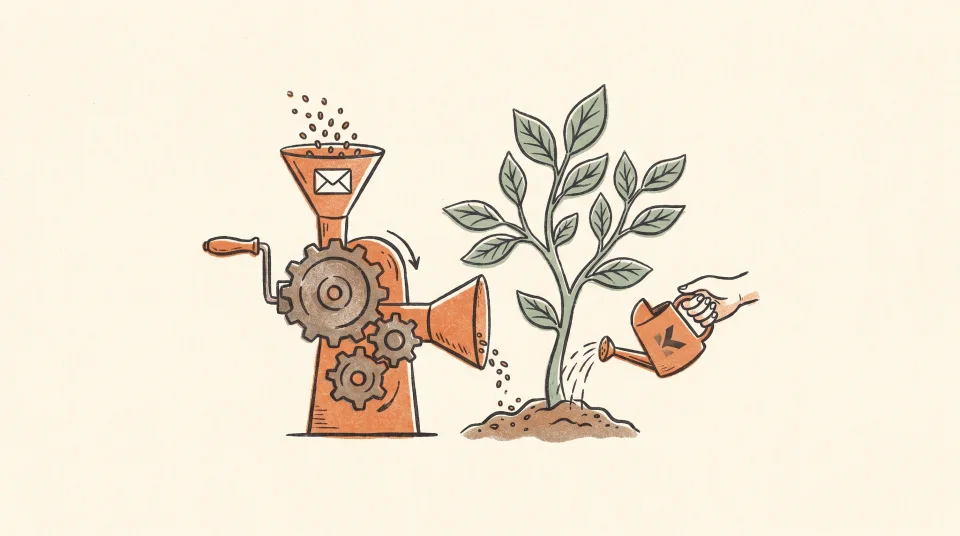
The filters, timing, and copy decisions above are the hard part of building this flow - most brands either skip them or get them wrong because the blank-canvas setup is tedious. Kaydence reads your store, auto-segments your audiences, and generates browse abandonment flows with copy written in your brand's voice and creative composited from your actual product images. Through Kaydence's done-for-you service, the flow is imported directly into your Klaviyo account - filters, timing, and all. You review everything, adjust what you want to adjust, and push it live when you're satisfied. The sending stays in your hands, in your Klaviyo account, where it belongs. A self-serve tool is also in private beta, ahead of a public launch in Q3 2026.
Growing your email list fast is easy. Growing it with people who actually open and buy is the hard part - and the only part that matters.
Back-in-stock emails reach people who already raised their hand. Here's how to build the flow so it actually converts when inventory returns.
Kaydence is the done-for-you Klaviyo email team - we build, write, and run your flows, campaigns, and creative. Book a free teardown and we’ll show you what we’d ship first.