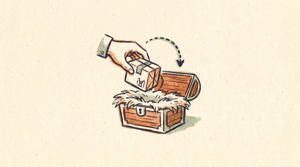
Playbook
Back-in-Stock Email Flows: A Sequencing Playbook for DTC Brands
Back-in-stock emails reach people who already raised their hand. Here's how to build the flow so it actually converts when inventory returns.
Most DTC email creative lands in one of two ditches: a wall of plain text, or a stock photo that could belong to any store in your category. Neither sells your product, because neither shows your product. The middle path is product-on-a-scene creative, and you can build it consistently without a designer on payroll.
You do not need a designer to make good email creative. You need a system and a clear point of view about what the image is for. The image is not decoration. It is the part of the email that does the selling before anyone reads a word, because most people scan an email before they decide whether to read it. If the visual is a slab of text, there is nothing to scan. If it is a stock photo, it is selling a mood that belongs to nobody. The job of the image is to show your actual product looking like it belongs to your actual brand.
Plain-text email has a real place. A founder note, a short heads-up, a one-line restock alert - those can land harder without any image at all. But you cannot run a whole program on plain text. An abandoned-cart email with no picture of the cart is asking the reader to remember what they almost bought. A welcome email with no product is a handshake with empty hands. People shop with their eyes.
Stock photography fails for the opposite reason. It is technically an image, but it is the wrong image. The smiling person holding a generic mug is not holding your mug. The reader has seen that exact frame in three other inboxes this week. Worse, stock teaches the reader nothing about the thing they might buy. You are spending the most valuable real estate in the email on a picture that could be deleted with zero loss of information.
Product-on-a-scene creative beats both because it does two jobs at once. It shows the literal product the reader is considering, and it places that product in a setting that carries your brand's mood. Your actual candle, on a real nightstand, in your warm low light. Your actual sneaker, on pavement that matches your palette. The product is the proof. The scene is the brand.
On-brand is not a vibe. It is a short list of decisions you make once and then repeat. When people say creative looks inconsistent, what they usually mean is that nobody wrote those decisions down, so every email reinvents them. Pin the following and most of the consistency problem solves itself:
Write these into a one-page reference. That page is the difference between a brand and a pile of pretty pictures. It is also the thing that lets someone who is not a designer produce work that still looks like you, because the hard taste decisions are already made.
Here is the practical move that replaces the photo shoot. You already own clean product images - the cutouts on white from your product pages. Compositing means lifting the product off that white background and dropping it into a generated scene that matches your brand reference. The product pixels stay real. The world around them is built to fit.
The two steps people skip are the two that matter most: the contact shadow and the light match. A product with no shadow looks pasted on. A product lit from the left in a scene lit from the right looks like a ransom note. Get those right and a composite reads as a real photograph to anyone who is not studying it pixel by pixel - which is everyone.
A single good image is not the goal. A welcome series, an abandoned-cart flow, and a post-purchase sequence that all look like the same brand - that is the goal. Consistency across a flow comes from reusing the same scene system, not from getting lucky three times in a row. Same light, same surface kit, same type, same crop logic. The product changes from email to email; the world it lives in does not. That repetition is what trains a reader to recognize you in the inbox before they read the sender name.
Build a small library and you stop starting from scratch. Two or three approved scene templates, your locked type, your contact-shadow recipe. New product drops into the existing system. A seasonal email is the same system with a swapped backdrop, not a new aesthetic. The point of a system is that the tenth email is as on-brand as the first, and it takes a fraction of the time.
This is the part Kaydence automates. It reads your store, pulls your real product images, and generates on-brand creative by compositing those products onto scenes built from your brand - the same light, palette, and framing held steady across a whole flow. It pairs that creative with brand-voice copy and assembles complete Klaviyo flows: welcome, abandoned cart, browse abandonment, post-purchase, winback. You review every email, adjust what you want, and approve. Then Kaydence imports the flows you chose straight into your own Klaviyo through the API, where you push them live. You stay the editor and the sender. Kaydence does the production work a designer would, on tempo, so consistency is the default instead of the thing you keep meaning to fix.
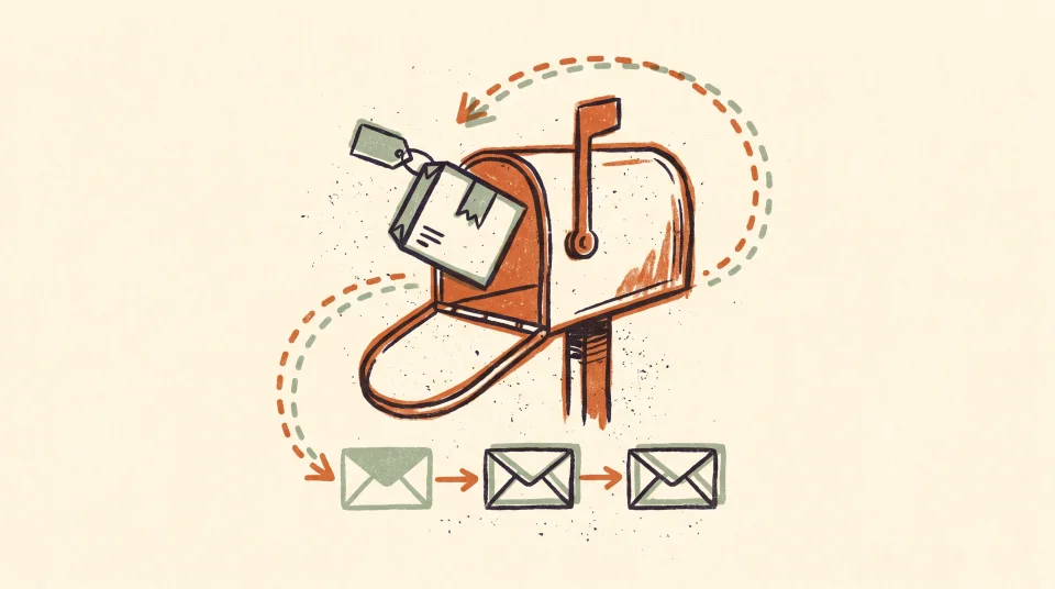
Back-in-stock emails reach people who already raised their hand. Here's how to build the flow so it actually converts when inventory returns.
Most DTC brands stop emailing after the order confirmation. That's exactly when the relationship is just getting started.
Kaydence is the done-for-you Klaviyo email team - we build, write, and run your flows, campaigns, and creative. Book a free teardown and we’ll show you what we’d ship first.